How Wolt Uses ProtoPie for Product Motion Design
Discover how the design team at Wolt uses ProtoPie to deliver delightful food ordering experiences.

Have you ever thought about all the interactions in your go-to food delivery apps that take you from discovery to delivery? Some of them may seem simple, but a lot of effort and teamwork goes into creating even the most basic motion designs—all with the end goal of reliable, yet enjoyable app user experiences.
That is certainly true at Wolt, the popular Finnish food delivery app, which has been acquired by DoorDash. Founded in 2014 in Helsinki, the company aims to bring the city into your phone and to your door. And in ProtoPie, the Wolt design team found a tool that could help them bring even their most advanced ideas to life with ease.
In our latest webinar, Samu Rintala, motion designer at Wolt, shared his insights on how his team uses prototyping in their food delivery app design workflow. Check the recording below, or keep scrolling if reading is more your cup of tea.
TL;DR
- Introducing the Wolt design team
- Product motion design at Wolt
- Examples of motion design in the Wolt app
- How Wolt designers collaborate for a seamless food delivery app design workflow
- Handoff to developers at Wolt
- Why the Wolt design team uses ProtoPie
- Tools for motion design in ProtoPie
- Motion design use cases with ProtoPie
- How Wolt plans to use ProtoPie in the future
Introducing the Wolt design team
Wolt's design team has 40+ product designers, content designers, UX writers, localization specialists, benchmarking experts, user researchers, and—last but not least—two motion designers, including Samu.
Catering to six major groups, the design team provides design support for the company's apps dedicated to consumers, merchants, couriers, groceries, B2B, and work.
Samu clarifies that the majority of their work takes place within the consumer-facing app. Nevertheless, they emphasize that they consistently approach all groups with equal care when it comes to motion. Ensuring a consistent experience across all Wolt-facing platforms is a crucial aspect of their mission.
Product motion design at Wolt
Product motion design can be generally defined as the application of animation, transitions, and visual effects to enhance the user experience and communicate information within a digital product or interface. It involves creating purposeful and engaging movements and interactions that guide users, provide feedback, convey hierarchy, and bring a sense of life and dynamism to the product. The goal of product motion design is to improve usability, delight users, and effectively communicate information, ultimately enhancing the overall user interface and user journey.
So, how does Wolt define product design?
People sometimes use different names like UX motion or interaction design to refer to product motion design, but they are somewhat different.
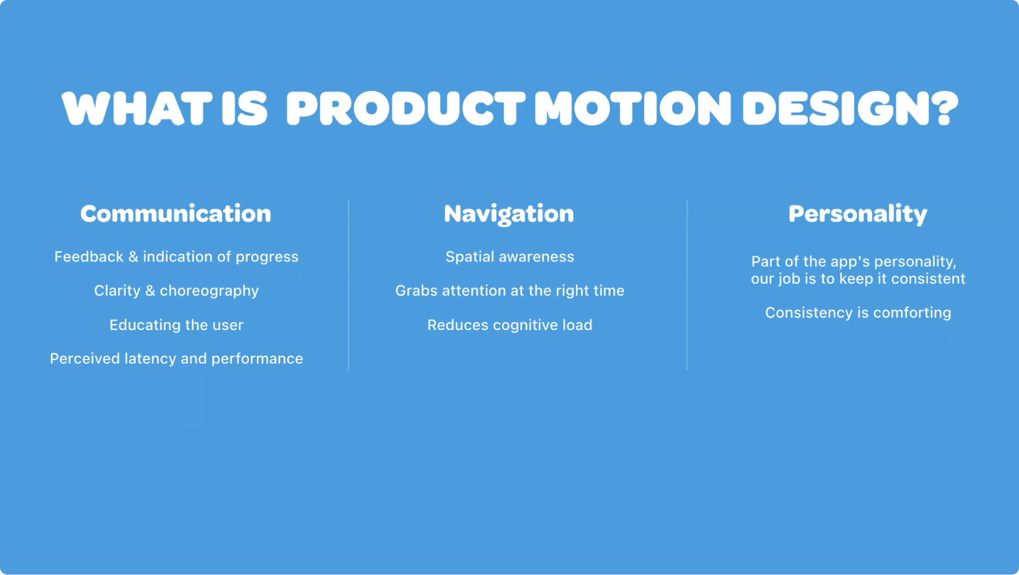
The Wolt design team defines product motion design using three key factors: communication, navigation, and personality.
.png)
Let’s dive into what that means in detail.
Product motion design means “Communication”
1. Product motion design is important as feedback.
Samu explains that the way he perceives it is similar to having a conversation with someone who doesn't respond or acknowledge in any way, leaving no indication that they are actively listening. This lack of feedback doesn't create a pleasant experience.
Feedback is important to indicate that something is happening and progressing. Just imagine an app UI that doesn't respond to any kind of touch—it would be confusing, to say the least, right?
2. It enhances clarity and choreography.
Samu emphasizes that the role of motion is to enhance the clarity of the app, rather than diminish it. According to him, the primary function of motion is to assist users in comprehending and grasping the actions and events occurring within the app.
3. It educates the user.
Education is another key aspect of product motion design at Wolt. They use motion to guide the users through the app UI, showing how to navigate it effectively.
4. It impacts perceived latency.
"A good motion design can play tricks on the user. For example, when there's loading happening or a need to wait for something to load, a simple loader animation can create the illusion of a faster experience," says Samu.
Product motion design means “Navigation”
1. It improves spatial awareness.
Spatial awareness is a crucial element of product motion design. Users need to have a clear understanding of their location within the app, how they arrived there, and how to navigate back or revisit screens in the future.
2. It grabs the user's attention at the right time.
This is also related to education in terms of telling the user what is happening, such as through warnings or pinging the user that they need to add something to the order to make it go through.
3. It reduces cognitive load.
"In total, all of these steps reduce the cognitive load for the user," says Samu.
Product motion design means “Personality”
1. It keeps the app's personality consistent.
Just as movement is an integral part of a person's personality, motion design contributes to the overall personality of the app.
At Wolt, the design team emphasizes the importance of consistency in the app UX. By adhering to their established principles and guidelines, they ensure that the app's motion design remains recognizable across different screens and interactions.
"Consistency is always comforting because you know how the app behaves when you do something with it," says Samu.
2. It gives peace of mind.
Ultimately, the aim of product motion design at Wolt is to provide users with peace of mind.
Samu explains, "When you're at peace of mind and enjoying and knowing where you are and what you're doing, then the delight comes with that as a whole experience."
Examples of motion design in the Wolt app
Now, we’ll have a look at examples of how designers at Wolt use motion in the Wolt app.
We'll start off with transitions—of which there are a few in the Wolt app—before looking at some of the smaller details.
1. Scrolling transitions
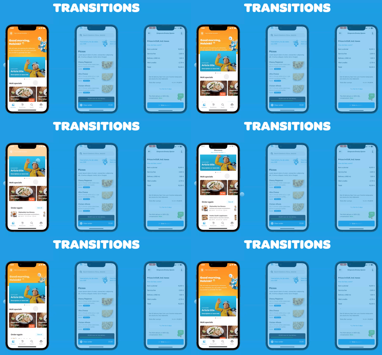
Samu explains that these types of transitions necessitate extensive choreography, as previously mentioned. This is due to the numerous elements involved and the crucial timing required for the header to appear and everything else to fade out precisely. Achieving this requires careful planning of hierarchy and ensuring the availability of assets for animation at the appropriate moments.
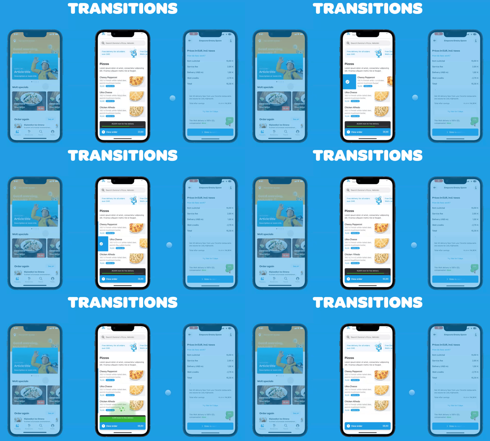
2. State change transitions
Below is a simple state change transition within a component.
3. Quick picker
"Smaller details are a big thing for us," says Samu. "I always think that divinity lies in the details, so these always combine together at the overall experience so much that they are worth it."
Here is an example of a small, but very important interaction that jumps the numbers underneath the user's finger when they add an item from the grocery store to their cart.
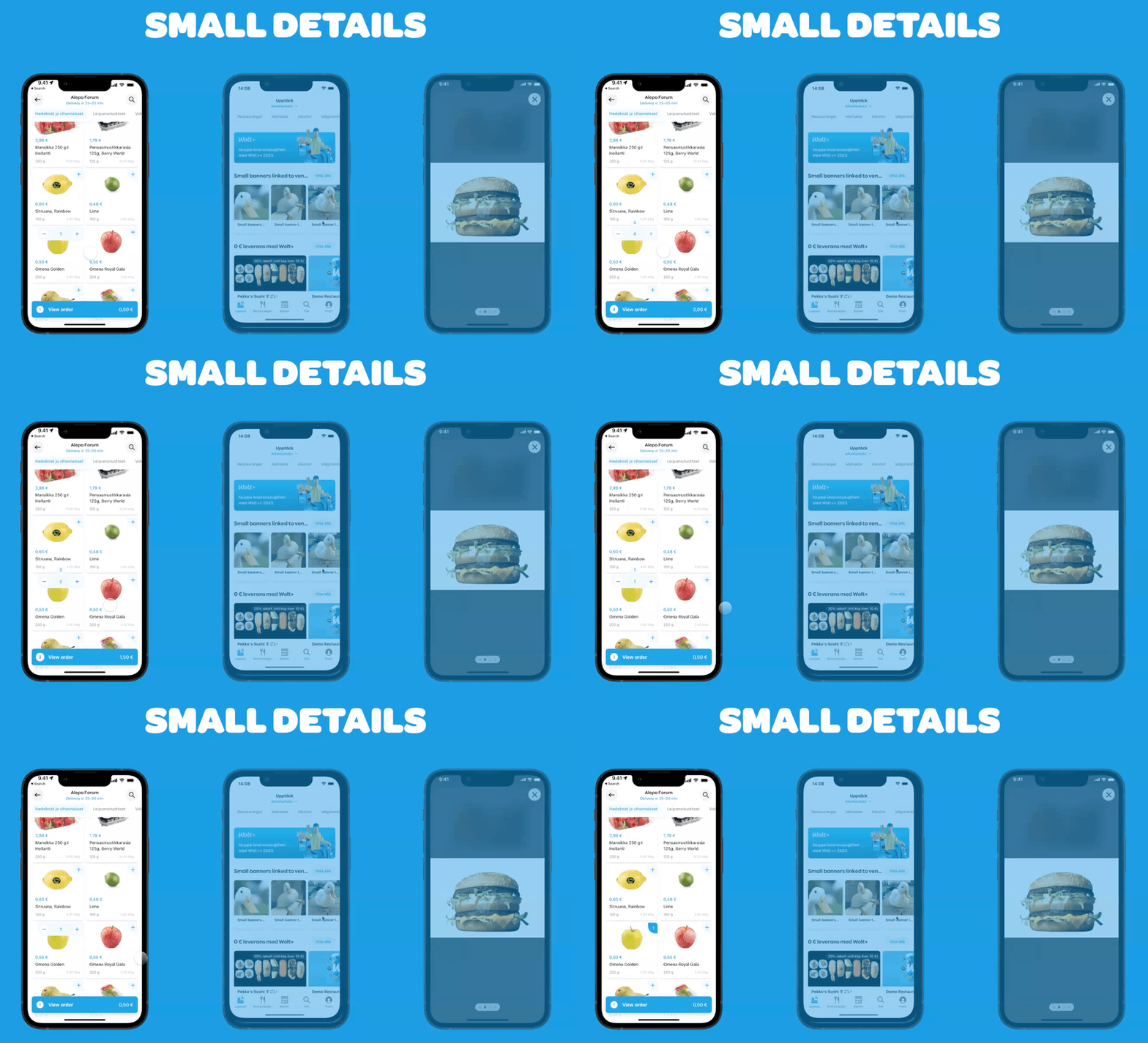
"These are some things that you don't think about if you don't actually test it with your hand and phone," adds Samu.
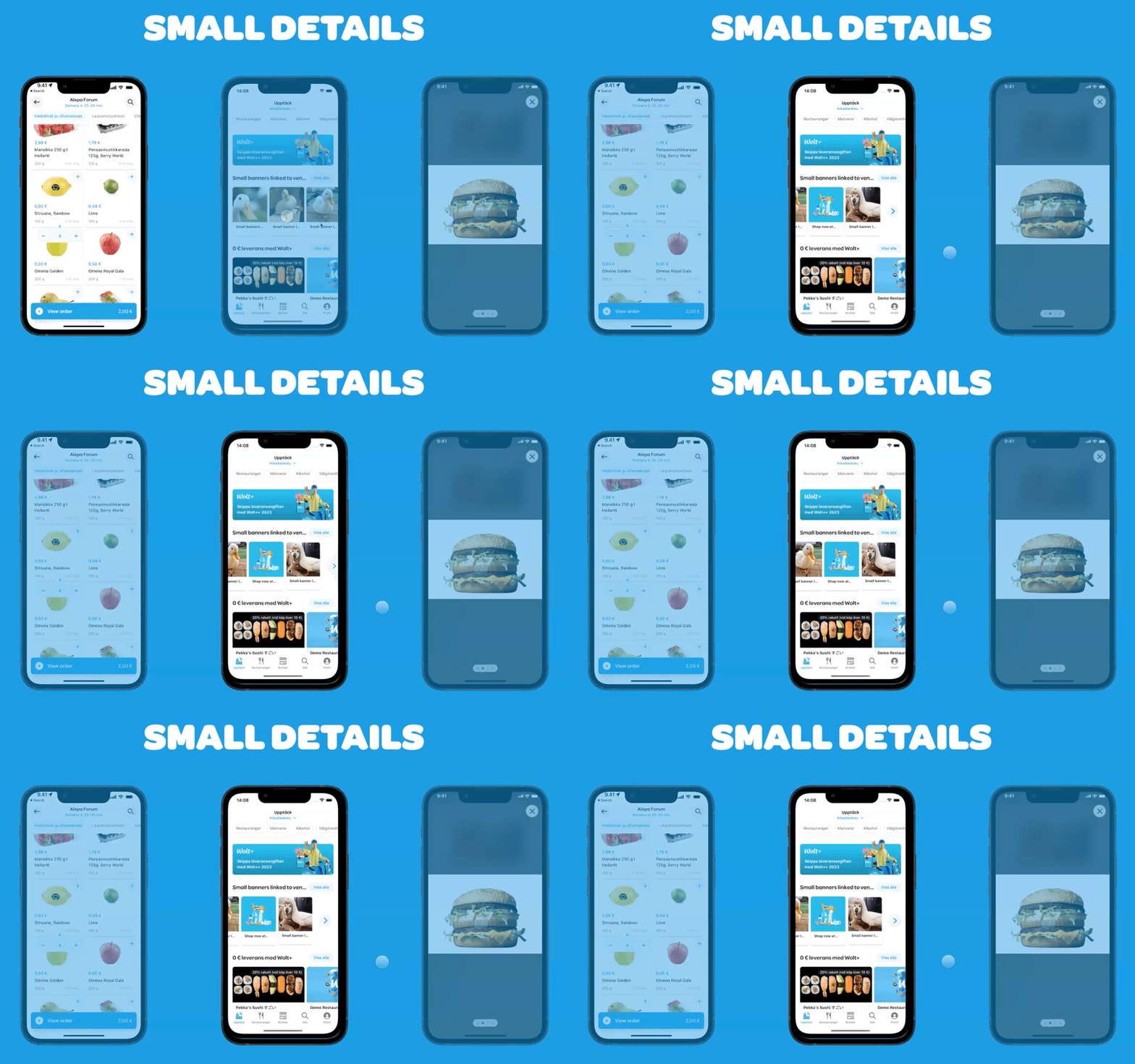
4. Arrow appearance
"This is where you can see the rest of the categories. The arrow appears with this very nice fluid motion from the side," explains Samu.
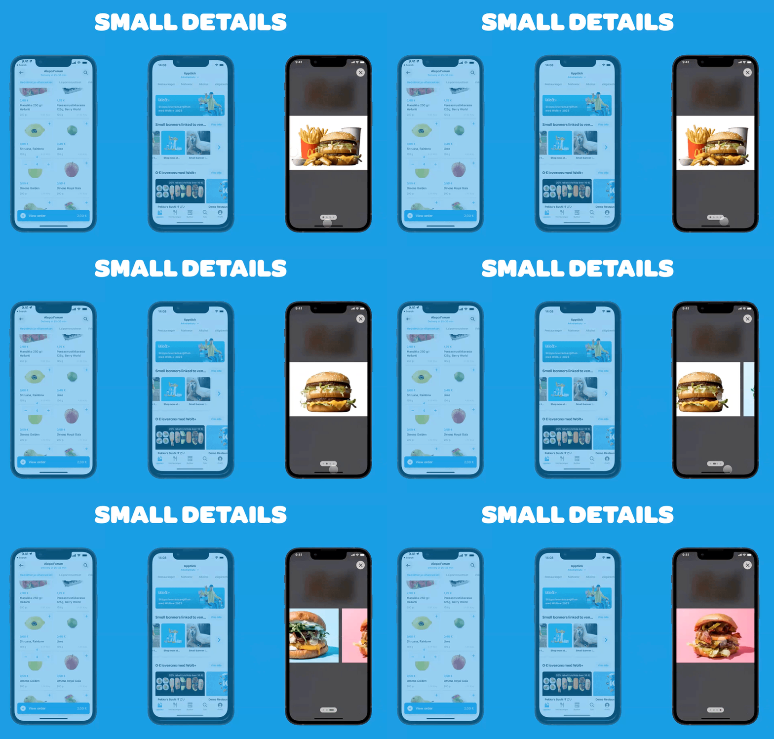
5. Basic image carrier
"Even in this very basic image carrier, we wanted to add little details in there, like a progress indicator," says Samu.
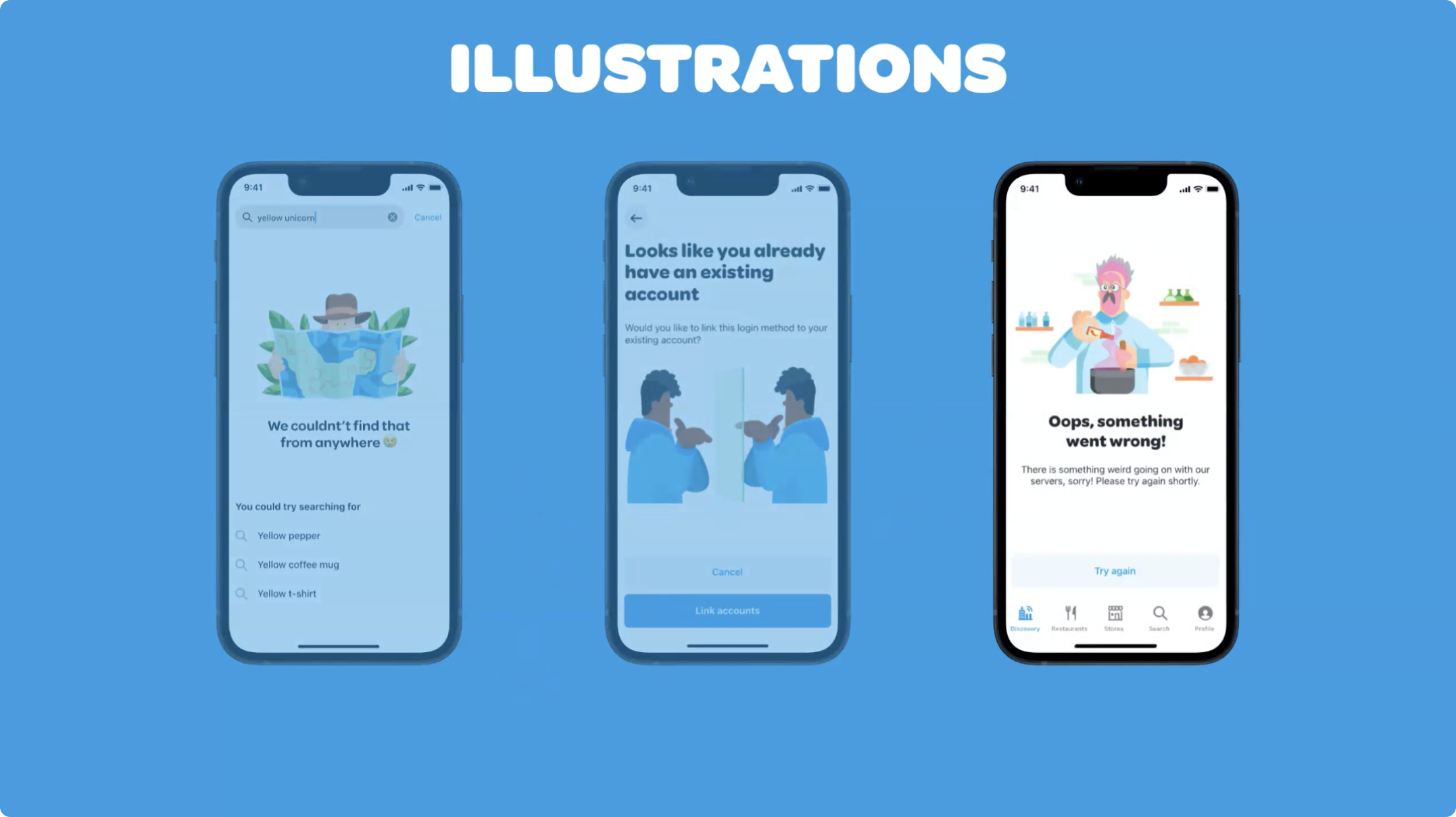
6. Illustrations
Samu highlights the significance of the numerous illustrations present in the app, considering them both highly valuable and visually pleasing additions. Typically, these illustrations are utilized to effectively communicate specific messages to the users. Despite serving as error messages, their impact is more readily embraced due to the inclusion of appealing illustrations.
.png)
"Some of these aren't even in the consumer-facing app," says Samu. "We have lots of these kinds of illustrations in our merchant app and courier app as well. We want everything to look nice, so there is a lot of motion goodness happening throughout our apps."
How Wolt designers collaborate for a seamless food delivery app design workflow
The illustration below shows how communication and collaboration between designers, engineers, and other stakeholders go back and forth in the app prototyping design workflow at Wolt.
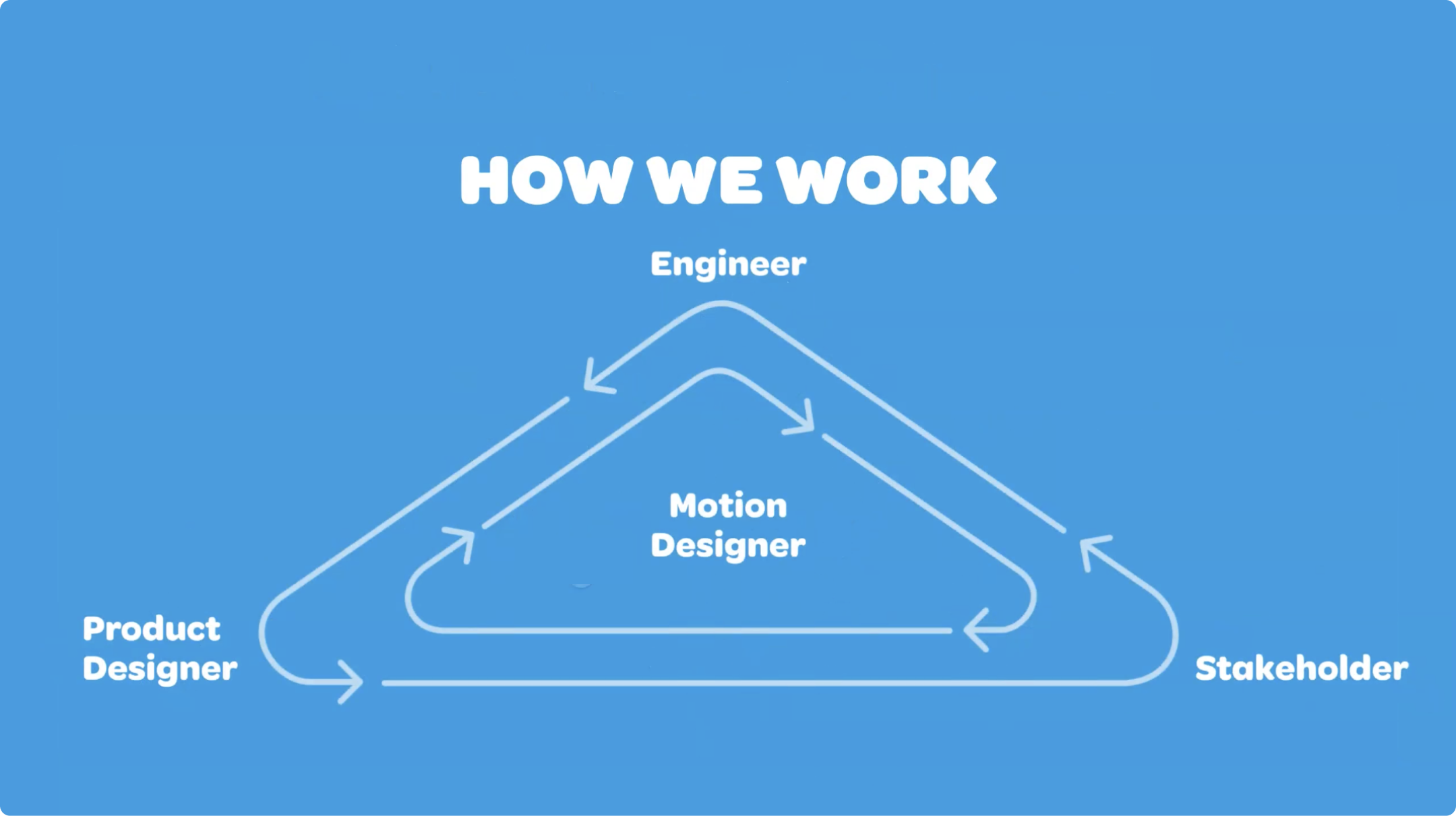
In addition to motion, the designers at Wolt help team members shape user flows, interface design, and screen transitions at all project stages.
Samu explains that as motion designers, their role lies in the middle, aiming to assist at various stages of the conversion process. They express a preference for joining the project early on since it allows them to provide the greatest level of assistance. Early involvement also facilitates extensive discussions with the team about integrating motion effectively in future endeavors, as there is more time for collaborative planning and strategizing.
He adds, "Of course, we can help at any time as well, but it is always best to design everything and start doing motion before engineering has started because sometimes there need to be changes in the code to actually make it work."
The final step, and one of the most important aspects of their role, is the handoff.
Handoff to developers at Wolt
The Wolt designers have a custom approach to the handoff process, which include
- Links to preview videos demonstrating the intended motions. This allows developers to understand the desired outcome and check what is supposed to happen in the timeline.
- Contact information for the motion designer. Sharing contact details enables open communication between designers and developers during implementation, especially if some designs turn out to be difficult to implement in code.
- Color-coded UI elements. The timeline includes matched color codes, the name of the interactions, and UI elements and properties such as easing, duration, and delay.
Handoff is also one of the stages where ProtoPie comes into play, with its native way of doing handoff through interaction recordings.
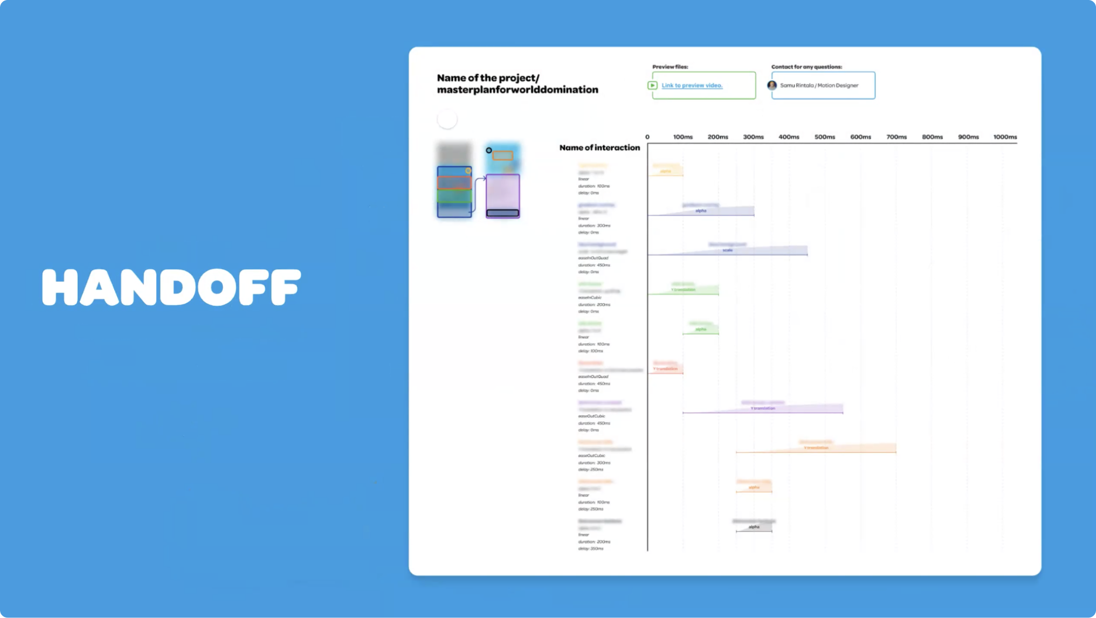
While Samu acknowledges the impressive capabilities of the ProtoPie handoff features, they prefer to have motion documentation alongside the design on a separate page, ensuring easy accessibility in the future. Despite this, Samu mentions that they have been utilizing interaction recordings frequently as it significantly expedites the process of copying and pasting the recorded interactions into the Figma file.
He elaborates, "I don't need to do any kind of going back and forth and checking values, but just copy-pasting here quickly and building the Figma handle from our own motion components there."
Why the Wolt design team chose ProtoPie
"Basically, we use ProtoPie mostly for motion design," says Samu. "For me, it's the go-to tool for anything outside of Figma, I basically only use ProtoPie."
Samu tells us that he has used ProtoPie for as long as he has worked at Wolt. He found it very easy to get going for anyone who had experience in motion, prototyping, or developing and programming basics, which really helps with understanding the advanced features of ProtoPie (although they are not necessary to start using the tool).
"Overall, I really, really recommend ProtoPie for product motion. They provide so many motion possibilities to do stuff easily," says Samu. "I think it's just as useful for smaller tests even."
While Samu has worked with other tools for motion design in the past, these are two of the reasons why he prefers ProtoPie:
- Native testing. Testing with an actual phone is a must for app product motion design because you can't get the correct feeling with just a mouse and a keyboard. It's important to check the timings and interactions with your phone.
- Cleanliness of the process. You can achieve a lot within a single scene, instead of having to place multiple connections and make a big mess.
Motion design tools in ProtoPie
These are the features the Wolt design team relies on for motion design in ProtoPie.
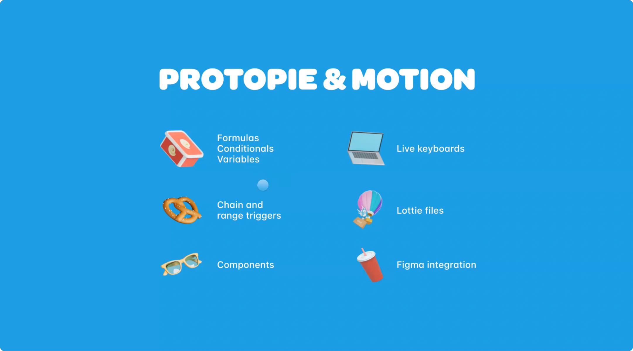
1. Formulas
“Formulas are basically like functions in code that you can use within ProtoPie,” says Samu. “We tend to use them together with conditionals and variables where you can use some kind of formula and store it in a variable, use that as a condition, and feed it to another variable.”
He adds, “Those kinds of positive loops within ProtoPie offer a huge benefit, so you can automate a lot of the motion there as well to get a real sense of how it works.”
2. Chain and Range Triggers
“Chain and range triggers are some of my favorites,” says Samu. “You can do a lot with chaining or doing something with a few values, so you can just perform a lot of motion with a simple trigger.”
3. Components
He tells us that send and receive triggers are also great for enabling communication between different components within the prototype, triggering all types of action in the main scene seamlessly.
4. Live Keyboards
“Live keyboards are very nice for prototyping, it saves time and makes it feel more real,” says Samu. “So when you are testing with your phone or and open like a focus on a text field, it actually opens the phone's own keyboard. So that helps a lot since you don’t need to fake it with something that isn’t interactable.”
5. Lottie Files
“Of course, Lottie files are playable within ProtoPie, which helps a lot with our illustrations and timing,” Samu says.
6. ProtoPie plugin for Figma
“The Figma integration is a must,” he says. “Nothing would basically happen without that.”
Motion design use cases with ProtoPie
Here, we’ll have a look at examples of designs Samu has built for the Wolt app UX using ProtoPie, showing how easy it is to create incredible results with pretty simple elements.
1. Worm-like animation using the Chain trigger
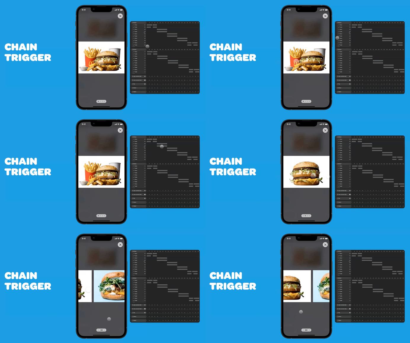
“This little worm was actually built using a single Chain trigger,” says Samu. “It's connected to the scroll offset of this image container.”
He tells us that once he built the system, it was easy to convey it to the developers. In this project, he relied solely on the interaction recipes as a test for handoff, which turned out to work very well.
2. Animations with Lottie support
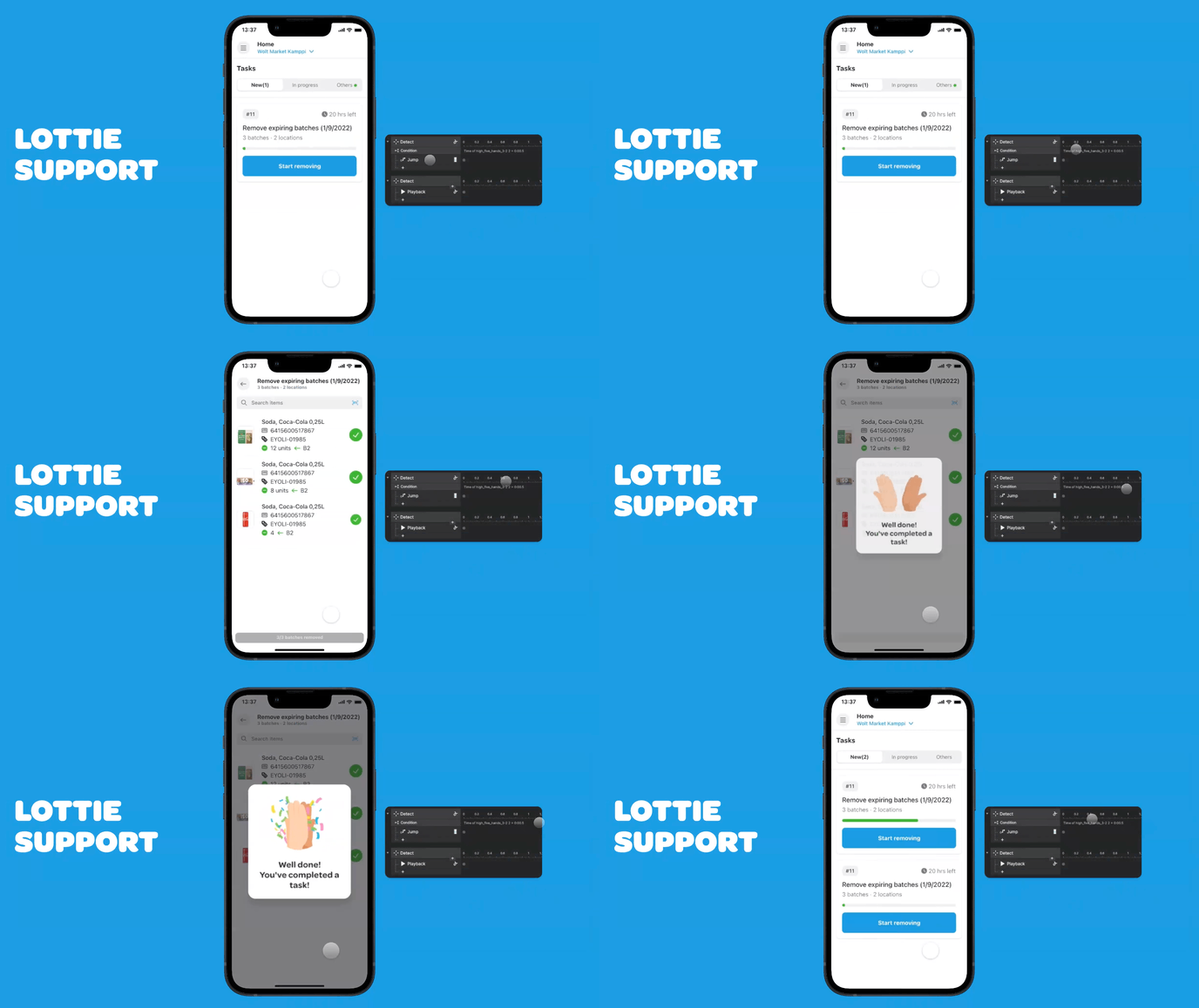
Samu explains that attempting to time animations with static image formats would be challenging. ProtoPie's support for Lottie files allows for precise timing, enabling smooth transitions and interactions between scenes.
“Here, I can get the timing of the Lottie, and use that as a condition before jumping to the next scene,” he says. “So these kinds of things wouldn't be possible if we couldn't get this kind of native support there.”
3. Range triggers with Lottie support
Samu also emphasizes the benefits of Range triggers combined with LottieFiles support.
“It provides much better context while doing these kinds of motion tests because here, the Range trigger is actually connected to the progress bar here,” he says. “So once it reaches the end, the Range trigger recognizes that it's finished and then it does all the rest of the motion. I think this provides the proper context for these kinds of moments, so you actually need to do a similar amount of work that the user would do before the actual animation would happen.”
4. Hi-fi app prototypes with the Figma integration
By exporting designs from Figma to ProtoPie for high-fidelity prototyping, Samu shows how he is able to quickly bring the static screens to life as a prototype that looks almost just like the final food delivery app UX.
With live keyboards and dynamic elements such as Lotties, he is also able to upgrade the prototype's fidelity and overall understanding of the user experience.
5. Map interaction
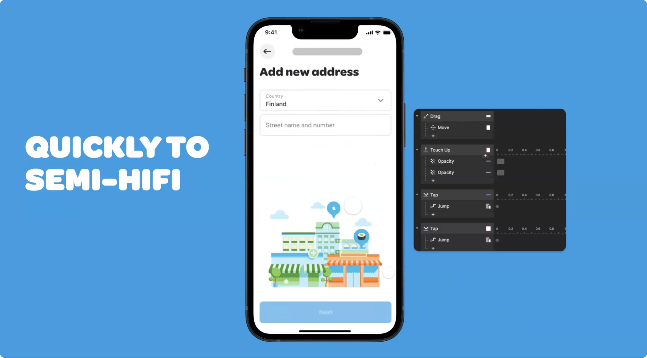
With just a few triggers, Samu showcases how ProtoPie enables realistic map interactions on the phone itself, making the prototypes feel like the real thing.
6. Triggers and components
Components play a significant role in Samu's design process. By leveraging triggers within components, he creates reusable interactions that can be easily accessed and integrated by others through ProtoPie's interaction library.
He suggests that using components is an immense time-saving opportunity. He further explains that there are smaller components where the time-saving benefits are more evident, and as you gradually assemble them, the cumulative time saved becomes significant. Therefore, he strongly advises embracing this approach.
7. Fast iterations
Samu showcases a simple example from the web interface to explain how quickly it is to iterate and test in ProtoPie.
He explains, “I built this dropdown, and once I got that done, I could easily just duplicate that a few times to talk with the developer about the edge case, like how, how scalable that animation is and how the offsets work if you have more stuff there.”
8. Off-screen in ProtoPie
An often overlooked creative use case of ProtoPie is the off-screen feature, which Samu describes as “a very powerful part of the app.”
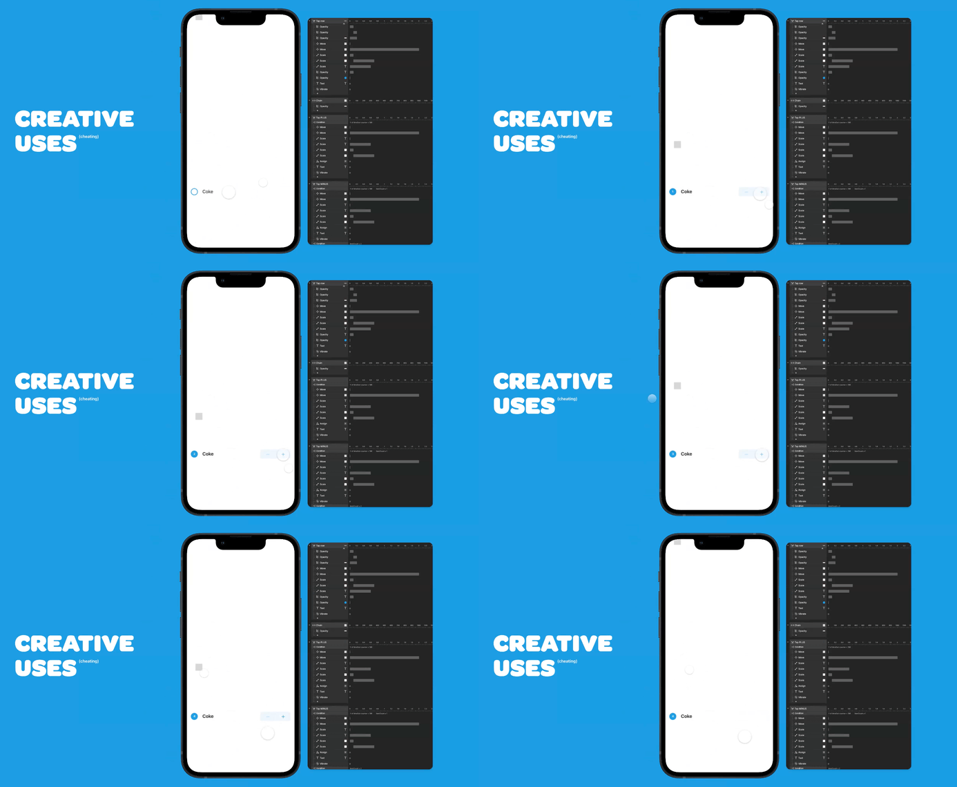
“This grey rectangle that is now animating on screen, it would usually be outside of the screen,” he explains. “But here I needed this natural timeout for these plus and minus buttons for this prototype.”
By showing how he can animate an element that exists outside the screen, he demonstrates its usefulness in creating natural timeouts and fading effects.
9. Simple pulsating dot
Even for small animations like a pulsating dot, Samu chooses to export everything from Figma and animate it in ProtoPie—simply because he likes animating within ProtoPie. He also appreciates the convenience of having all design elements accessible within a single app.
How Wolt plans to use ProtoPie in the future
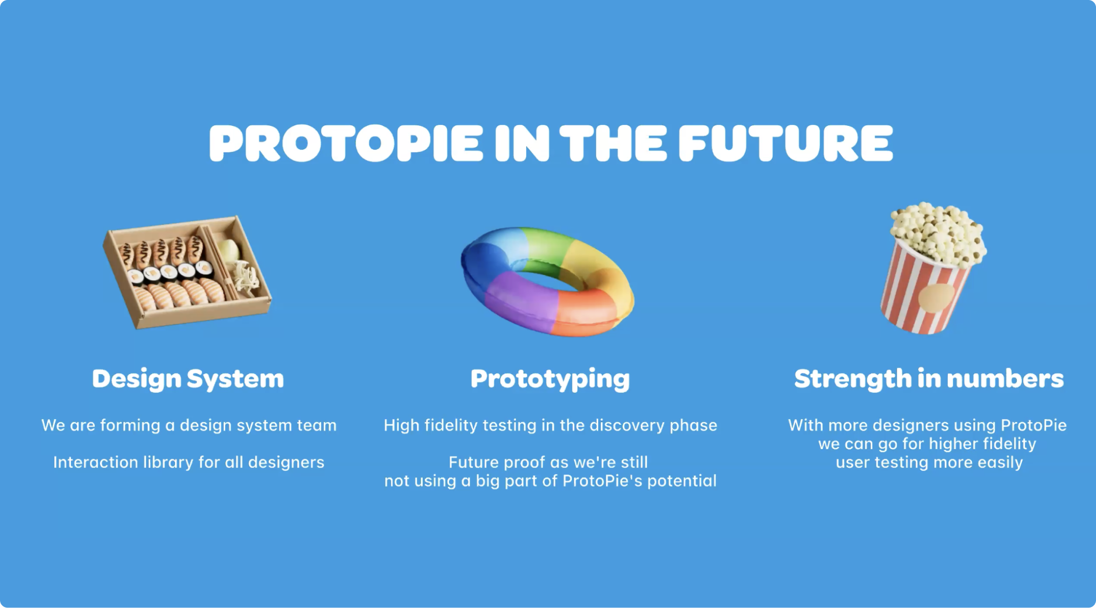
At the moment, Wolt uses ProtoPie for motion design, but the designers have exciting plans for how other members of the team can also make use of it in the future.
By establishing a design system with an interaction library for all designers, Samu tells us they intend to expand the possibilities for high-fidelity prototyping and testing, even during the early discovery phase.
“These kind of tests actually prove much better if we're going to the right direction,” Samu says. “I think it's very future proof for us in that we are still using pretty basic parts of the product, and I really like that there's the possibility of like voice interaction or these kinds of things that we probably can use in the future.”
As a final note, he says that, “Once we get more designers on board, we'll probably get more jobs in ProtoPie as well so we can do more, more hi-fi prototyping and even user testing, which is now possible in ProtoPie as well.”
Discover a simple path to advanced app prototyping with ProtoPie
ProtoPie gives the designers at Wolt and thousands of other companies an easy way to bring their ideas to life, all the way from ideation to testing. Join them and try ProtoPie for free now!
